In a review of James Elkins' book, Pictures and Tears, Nigel Spivey wrote, "To cry in front of a work of art is not a sign of weakness: it is the flexing of a truly aesthetic power." Inside Pictures and Tears, Elkins discusses at length the apprehension he encountered when asking art historians to comment for his book. He asked them if they had ever "cried in response to an art work" and if they thought there might be a "link between the "knowledge" gained by crying and the knowledge--not in quotation marks--acquired by studying." (94) In other words, does learning and scholarship kill emotion? Most of the scholars he wrote to responded unambiguously with comments akin to crying having no place in the discipline of art analysis. This type of aggressive response only leads me to believe that Elkins may have hit a nerve. Who do you agree with? Does the amount of information you have on a painting affect the emotional gravity of your reaction? And if so, does art scholarship work to inhibit or amplify the viewer's pure reactions? Have you ever cried or felt a strong emotions towards a painting?
Things to consider:
20th century apathy
Neo-Romanticism
17th century Romanticism
The emotive quality of movies vs. paintings?
Religious motifs (or lack there of)
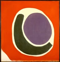
Mark Rothko
Friday, February 15, 2013
Monday, November 5, 2012
Considering Location: A Post-Apocalyptic Reading of Thomas Demand's "The Dailies"
On March 23rd of this year I attended a Thomas Demand art exhibition titled The Dailies at the Commercial Traveler's Association, which is located within the MLC Center in the heart of downtown Sydney's Martin Place. After reflecting on the content of the exhibition and its extraordinary location, I've come to believe that these artworks address some of the questions I've recently pondered regarding contemporary photography and art in general.
It's no secret that contemporary photography has played an increasingly central role in the art world within recent years. Many art historians--such as Michael Fried--believe the emergence of tableau-sized photographs to be "one of the most important developments in the so called visual arts of the past twenty plus years" (for more reading on that, I recommend his book Why Photography Matters as Art as Never Before). The auction price of contemporary photography now rivals easel painting and the demand for Demand reflects this change in taste.
In addition to the art market change, the way in which people view photography has also changed--photographs now exist in a post-photoshop culture. People question the content of photos much more now than ever before in history. Ask anyone to comment on the latest cover of any fashion magazine. She/he is likely to eventually comment on the amount of airbrushing the cover's final result required. Turn back the clock fifty years and the skepticism regarding a magazine's pictorial purity is essentially non-existent.
Back then, photos were assumed to be representations of truth or documentary evidence. Why wouldn't they? Back then photographers were unable to take liberties by way of digital manipulation. Criticism of photography being staged or fake is predominantly a late 20th century observation. Over time however, software like photoshop enabled them to create and distort photos. Contemporary photographers like Demand reacted to this shift by playing with the assumption of a photograph's documentary quality.
Thomas Demand doesn't digitally manipulate the content of his photos, instead he uses subterfuge to trick the viewer into believing what they are seeing is real. Demand is known for taking photographs of three-dimensional, paper models that look like real images of rooms. These rooms are often recreations of historical places loaded with social and political meaning. In the Dailies Demand's MO stays the same while his motifs and materials change. Typically forgotten objects such as a clothesline, a saucer, construction site materials on the street, or a children's footstool (below) are made into faux models. The models are then photographed using extremely rare color print film. Demand is famous for destroying his models after the photograph is finished.


Today's art exhibitions are no longer limited to small white cubes filled with paintings and sculpture. The fear of distracting the viewer from the artwork is all but eradicated. Instead, viewers are invited to spaces that play into the reading of the artwork itself. For example, when Jeff Koons' exhibited his sculptures at Versailles in 2008 (the Château's first art exhibition), the art and it's setting were indistinguishable. One couldn't help but consider the interplay between the opulence of Versailles and the colorful optimism of Koons' sculpture. Their lavish, coloristic style complimented each other and simultaneously added another symbolic layer to the exhibition, the most obvious being the parallels between the current US economic climate and the French Revolution.
In the midst of Louis XIV's rococo decadence and Koons' post-modern frivolity lies a darker subtext. Versailles is definitely one of the most beautiful palaces in all of France; however it's also the site of catastrophic social tension due to the French aristocracy's dismissive reply to the cries for help from the impoverished lower class. By displaying his notoriously expensive and gaudy sculptures at Versailles, Jeff Koons manipulates the context in which the art is shown and in doing so, castes light upon current social problems that are analogous to previous historical events. One of these social issues being the increasing isolation of the upper and lower classes in America. It is this type of recurring social phenomenon, this polarity, that led to eventual revolt from the masses and the 1789 French Revolution (for further reading on the isolation of the American upper and lower classes, I recommend Charles Murray's Coming Apart)


It's no secret that contemporary photography has played an increasingly central role in the art world within recent years. Many art historians--such as Michael Fried--believe the emergence of tableau-sized photographs to be "one of the most important developments in the so called visual arts of the past twenty plus years" (for more reading on that, I recommend his book Why Photography Matters as Art as Never Before). The auction price of contemporary photography now rivals easel painting and the demand for Demand reflects this change in taste.
In addition to the art market change, the way in which people view photography has also changed--photographs now exist in a post-photoshop culture. People question the content of photos much more now than ever before in history. Ask anyone to comment on the latest cover of any fashion magazine. She/he is likely to eventually comment on the amount of airbrushing the cover's final result required. Turn back the clock fifty years and the skepticism regarding a magazine's pictorial purity is essentially non-existent.
Back then, photos were assumed to be representations of truth or documentary evidence. Why wouldn't they? Back then photographers were unable to take liberties by way of digital manipulation. Criticism of photography being staged or fake is predominantly a late 20th century observation. Over time however, software like photoshop enabled them to create and distort photos. Contemporary photographers like Demand reacted to this shift by playing with the assumption of a photograph's documentary quality.
Thomas Demand doesn't digitally manipulate the content of his photos, instead he uses subterfuge to trick the viewer into believing what they are seeing is real. Demand is known for taking photographs of three-dimensional, paper models that look like real images of rooms. These rooms are often recreations of historical places loaded with social and political meaning. In the Dailies Demand's MO stays the same while his motifs and materials change. Typically forgotten objects such as a clothesline, a saucer, construction site materials on the street, or a children's footstool (below) are made into faux models. The models are then photographed using extremely rare color print film. Demand is famous for destroying his models after the photograph is finished.


Only upon close inspection is the viewer able to recognize the subtle clues that lead to the photos' inauthentic content. They are meant to compel the viewer to question what they see as reality. What is reality? Does reality even exist or is the world an illusion? A dream? How do we determine what pictorial content is authentic if technology has rendered us incapable of doing so? A reading of this work would typically end here if these photographs were hanging in a gallery or museum, but Demand's specificity in choosing a location lends his work to new interpretations.
Today's art exhibitions are no longer limited to small white cubes filled with paintings and sculpture. The fear of distracting the viewer from the artwork is all but eradicated. Instead, viewers are invited to spaces that play into the reading of the artwork itself. For example, when Jeff Koons' exhibited his sculptures at Versailles in 2008 (the Château's first art exhibition), the art and it's setting were indistinguishable. One couldn't help but consider the interplay between the opulence of Versailles and the colorful optimism of Koons' sculpture. Their lavish, coloristic style complimented each other and simultaneously added another symbolic layer to the exhibition, the most obvious being the parallels between the current US economic climate and the French Revolution.
In the midst of Louis XIV's rococo decadence and Koons' post-modern frivolity lies a darker subtext. Versailles is definitely one of the most beautiful palaces in all of France; however it's also the site of catastrophic social tension due to the French aristocracy's dismissive reply to the cries for help from the impoverished lower class. By displaying his notoriously expensive and gaudy sculptures at Versailles, Jeff Koons manipulates the context in which the art is shown and in doing so, castes light upon current social problems that are analogous to previous historical events. One of these social issues being the increasing isolation of the upper and lower classes in America. It is this type of recurring social phenomenon, this polarity, that led to eventual revolt from the masses and the 1789 French Revolution (for further reading on the isolation of the American upper and lower classes, I recommend Charles Murray's Coming Apart)
Just as Versailles impacted the historic and symbolic interpretations of Koons' 17 sculptures, the meaning of Demand's photographs change when one considers the location they are exhibited. I propose that the artist may have intended for the Commercial Traveler's Association to play a role in the artwork itself. After all, Demand describes himself not as a photographer, but as a conceptual artist for whom photography is an intrinsic part of his creative process. So why this space?

The Commercial Traveler's Association (seen above) is an odd place to run an exhibition. The building sits in the middle of Martin Place, a community square in the heart of Sydney, surrounded by skyscrapers, high-end boutiques, and neoclassical banks. It was created by the famous Australian modernist architect, Harry Seidler in the mid 1970s and is used to accommodate traveling retailers and businessmen visiting/working in the area.
Yet despite its standing as a historic building and its peculiar appearance (Frank Lloyd Wright meets Mies van der Rohe?), most Sydney locals don't know the building's history or function. Most pass it by as if it doesn't exist. This idea of being unknown or forgotten must have intrigued Thomas Demand, after all, the objects and spaces in his photos are all depictions of lost memories, the things we ignore.
The building has a futuristic style and function-based format. I've heard it's exterior be described as a stylized mushroom, a space ship, and (my favorite) the house of the Wizard of Aus. It has a tubular stem that clouds at the top to make room for the commuter bedrooms. Two strips of long, horizontal black windows surround the upper level allowing lots of natural light. It's a fabulous example of modernist architecture in Sydney.
It's interior is purely utilitarian. When I visited The Dailies exhibition, I walked up a spiral staircase, through the building's stem. At the top, I came to a curved corridor that ran the circumference of the upper layer. The hallway was lined with doors that led into small rooms, each complete with a bed, a desk, mini-fridge, vanity, window, and upside-down water glasses on paper doilies. Everything one needs to live... simplistically modern. Demand hung one photograph above the bed in each of the facility's 15 rooms. Small segments of a larger short story were written on laminated note cards and set upright against the vanity's mirror in each room out of chronological order.

Upon entering each room, I felt a sense of sterility that was juxtaposed by the busy city streets visible through the windows. The beds were perfectly made, the floor was spotless, the rooms were claustrophobic. The short story segments referenced objects that were visible from the window's view such as telephone wires, tree leaves, and city streets. The story was loosely based on the artist's time in Sydney, what he observed, what he did, and how he thought about the room. The writing was surprisingly nostalgic. It was the only thing imbued with emotional content in the room.
One card stood out to me. It described the rooms as a space modules, and compared the building to a space station. Indeed, the room was lifeless enough to transcend time and space. There was something austere and uncanny about its perfection. The living spaces were so lifeless, I felt as if I was intruding. What was it about the room that made me feel this way?
Most of the other visitors focused on Demand's photographs--not surprising considering those are the pieces he is famous for. But there was something bigger here, something I think most people overlooked. The context of the room and the building were impacting the way in which I read the photographs. I felt as if the photographs were an extension of the staged environment, merely props. They perpetuated that same sense of static neurosis. Small, incidental subjects from life, as if you had seen and forgotten them immediately. Why place value on these banal things?
I suspect one reason may be to remember them somehow, as if these were precious images of a time now gone. I contend that Demand's rooms were suspended in time in a post-apocalyptic realm. I believe he wanted the viewer to transcend time and inhabit a space where our current everyday occurrences are valued and cherished. This is a Realist reading from a 22nd century perspective. The artist is trying to make everyday motifs appear sentimental. One can imagine Demand's models acting as makeshift realities, a desperate attempt to remember a life of the past, a life now gone. This is the artist's created reality, his way of expressing his desire to go back to a simpler time.

I believe the above interpretation answers many of the questions I had regarding Demand's work. (1) It explains why Demand decided to change the subject matter in his photographs. He wanted the viewer to feel as if they were in one of his paper models from previous work--bereft of human life, but full of historical and symbolic significance. This signifies a development in Demand's work, as if he wants to impose upon the viewer a more immediate interaction with his created reality. (2) It explains why he went to great lengths to find the perfect building that would fulfill his vision. From the outside, the Commercial Traveler's Association looks like a building of the future; on the inside, it resembles a utilitarian bunker. (3) This exhibition also recalls the artist's background in sculpture. Ostensibly, I'm suggesting that The Dailies is a series of installations instead of a series of photographs--that the art encompasses the entire building, as if it were a found object. (4) As an overarching theme, The Dailies represents the ephemeral nature of life as we know it. This message is echoed in many other elements within Thomas Demand's work even down to his materials (the film Demand uses is going extinct).
It appears that contemporary artists are using their environments to play a role in their work so that art and exhibition inevitably become indistinguishable. I think Thomas Demand represents this type of art making and exhibiting. He has the ability to use the exhibition site as an extension of the artwork, but I'm also interested in the viewer's role. Next time I'll be discussing participatory art and it's impact on contemporary art exhibitions and its greater symbolic significance.
Thursday, June 28, 2012
Pop Goes the Art World
Strong emotions may arise from the subjects presented by Pop art, but this style rarely takes inspiration from the spiritual, sensitive, emotionally expressive. In fact, Pop can be seen as a direct reaction against abstract expressionism, the preceding movement that tried to appeal to the viewer's emotions through pure color and form (very much like the painting discussed in the previous blog). Pop art is more concerned with the exterior rather than interior--cultural criticism prevails over the internal angst. Because of this, Pop art was thought to be a more accessible or democratic art form and therefore more attuned to contemporary life. Pop artists began to grow tired of anything related to the reconciliation of blobs of paint and human emotion. They wanted to explore the human condition through tangible, worldly associations. So they made fun of what they didn't like. Pop art revels in parody, humor, kitsch, graffiti, pornography, satire, comics etc.--anything that is typically seen as low brow culture by the bourgeoisie.
The most well know pop artist is of course Andy Warhol. I'll use his Gold Marilyn of 1962 (below left) and Lee Krasner's Celebration of 1960 (below right) to better illustrate this transition.


Krasner's painting depends on the viewer's imagination and emotional sensibility. Nothing from the real world is depicted in this image to signify a specific celebration. The only way to connect the painting with its title therefore, is to imagine the general implications of the color and form. This is by no means a somber, quiet image. It's loud and boisterous. Every form merges into the other in an orgiastic chaos that could only allude to a celebration of music and dance. The brushstrokes are aggressive, agitated, and very conspicuously applied, with large globs of paint producing heavy impasto. The shapes are biomorphic (of or relating to nature) and individually discernible as if these entities within the image are moving and dancing in dynamic motion; but every identity is nondescript. No reference to reality is indicated, the viewer is left to fill those gaps him/herself.
The Warhol on the other hand, leaves nothing to the viewer's imagination. Whereas in the Krasner painting, the entities are unidentifiable and the cause for celebration is ambiguous; in the Warhol, the spectator is confronted with an instantaneously recognizable subject, a screen printed image of Marilyn Monroe, the great starlet of the 50s and 60s. The image is silkscreened onto a canvas that is covered in gold leaf. It's a very frontal image, simplistic in nature, mysterious in meaning.
When the Viennese Symbolist artist, Gustav Klimt, produced his Kiss in 1907-08 (below left) people constantly referenced it's gold leaf embellishments as an homage to Byzantine mosaics and iconic portraiture (below right). Warhol parallels Klimt's modus operandi, but does it in a much more modern way. Consider the year Warhol created this painting, 1962--the same year of Marilyn Monroe's death. This is not a portrait so much as it is a memento mori (an object serving as a warning or reminder of death, such as a skull). Warhol asks the viewer to remember Monroe just as the Byzantines remembered the great monastic recluses of their time--icons (or a person representative of a symbol of something). In a sense, he's making fun of this very serious art tradition where the great religious men of the past are remembered forever by means of art. Here Warhol attempts to commemorate the great people of the past (men or women (or both)) who were the main protagonists in his fascination of glamour and fashion.


But Marilyn Monroe was representative of nothing else but decadence and glamour gone wrong in hollywood right? You'd be half right, but if you stop there, Andy wins. Think about the term "superficial." Warhol loves superficiality. He loves assimilation, disguise, deception, and any other entity that distracts people from reality. This includes things like glamour, fashion, make up and the like. Why would he want to do this? Partially because I think Warhol liked to play games with his viewers. The Krasner painting lends itself to a very subjective experience, one could imagine all sorts of things happening within it and one may also feel isolated from the celebration or comforted by it's optimistic bright colors and dynamic shapes. Warhol demands a much more methodological reading of his paintings. He likes the unsolved riddle to have layers to peel apart. Warhol after all was so often mischaracterized as a no brainer, pop idiot who didn't know whether he was a foot or horseback (could you blame his critics? Consider the video below).
The truth is, it was all a farce. Warhol was very well versed in art history and knew exactly what he was doing. He wanted to portray himself a certain way in order to (I think) be somewhat of a performance artist, one who truly lives their performance and makes people think of him in a very specific way. This was as much of a deception as Marilyn Monroe's career, because everyone knows that Marilyn was not as happy in her private life as she was on screen. Everything about Marilyn Monroe was part of her performance, it wasn't real. From her relations with men, to her very name (Marilyn Monroe's real name was Norma Gene) Marilyn Monroe was an embodiment of the fake, or make believe glamour. She played as much of a bimbo persona as Warhol and both pulled it off miraculously (Marilyn Monroe had an IQ of 163 which at the time would have made her the intellectual equivalent of Einstein).
So what do we have with Gold Marilyn? A prediction. A screen printed photograph that commemorates what Warhol saw as the quintessential celebrity of our time. He very much predicted our culture's fascination with fame and fame's ability to lead to it's victim's demise (either by reputation or in death). But look again and consider the nature of her actual portrait. Warhol brilliantly paints over the screenprinted photo, as if to add yet another layer of glamour onto the pure or real photo. The luminous color then represents the celebrity of Marilyn Monroe that was painted onto the real woman of Norma Gene, and of course he does this throughout his career with virtually every main celebrity of through the 80s.
Emotionless, sterile, severe? Maybe. But prescient? Certainly. Warhol allows the viewer to see the world through his eyes, bereft of spiritual transcendence. But yet another layer to Warhol's superficial work of art is it's entire disparate meaning from one's first glance assumption. Most of Warhol's art has deep theological, darker meanings about existentialism, ontology, and death. He leaves the viewer to pick apart these deeper meanings instead of providing all of the answers.
The battle between abstraction and real world motifs continues to this day. Which do you prefer and why? What other cultural phenomena did Warhol predict and is that the appeal of great artists in general? Is the role of the artist partially to predict the future?
Thursday, March 29, 2012
Greenbergian Abstraction
I've decided to do something rather drastic. I'm going to fast forward about a century in time to discuss post painterly abstraction in the 60s. This is treason in most art circles, but I've already established that this isn't a art history blog, and frankly on this page, I'm God so I can do what I want.
Clement Greenberg wasn't an artist, he was a critic. Through the greater part of the 50s and 60s he dominated the New York art world by what some would call despotic methods. Cantankerous and brusque, Greenberg often prided himself on his (what he believed to be) most modern of tastes. In 1961 he published a book titled Art and Culture that recounts his beliefs.
Perhaps aside from the advent of world wars (which are book long discussions in and of themselves) Greenbergian philosophy signals the single greatest shift in the way that artists create since the turn of the century. Abiding by (and reacting against) Greenberg's strict if not tyrannical standards, artists began to recognize the act of painting as equally important to art as its content.
Greenberg believed that the art should be about the medium itself, and rely less on foreign entities to determine its content. Additionally, he believed that any indication of alternative influence was bad for the overall effect of the work. So Greenberg likes abstraction that does not allude to an outside world, he believes in 2 dimensional painting. He believed that anything that looks three dimensional in a painting would be better suited for sculpture. Any story told through the painting, or narrative, would be better left to literature. Therefore the paintings Greenberg endorsed were those that celebrated the act of painting itself in an effort to purify painting.
This philosophy relates to what I discussed in my last blog (which was months ago, sorry!!!) Remember how we examined how Mancini's painterly technique was so drastically different from Bouguereau's? Mancini is less interested in confusing the viewer with what is real and imagined in his painting. The paint is conspicuously there, there's no effort made to allude to photography (photo-realism). Therefore he appreciates the paint itself, it's consistency, the impasto, the texture, its sensuous virtuosity. But Greenberg would have hated both Mancini and Bouguereau's works (though he would have liked Mancini's more) because both contain images of things found in the real world (human figures, atmosphere, landscape, etc.). Greenberg much prefers paintings like the one seen below, Jules Olitski's 1962 painting The Prince Patutsky-Red.
This painting holds some fascinating characteristics that were specifically aimed to making critics like Greenberg happy. The first is the lack of impasto. It almost looks like a water color in person. This is because Olitski used a paint application process called "soak stain painting," a technique invented by another post painterly abstractionist, Helen Frankenthaler. Paint is submerged and diluted in water and then applied to an unprimed canvas, allowing the paint to literally merge with the canvas to become one. This process leaves very little to no impasto and is usually applied through pouring the paint onto the canvas. This makes every painterly technique of the past seem sculptural in even the slightest form of impasto, and remember, Greenberg doesn't like painting and sculpture intermingling.
The form in the Prince Patutsky brings to mind images of the womb, fruit, an olive, an eyeball, something organic found in nature. The shapes are elongated and the colors are almost as ambitious as the scale (92 in x 88 1/4 in). Olitiski goes to great lengths to constantly remind the viewer that they are looking at a painting, not an illusion of reality. Consider how the paint fades away at the bottom segment of the canvas, and left, almost as an ear marker at the bottom left of thepicture. This exposes untouches canvas. Olitski wants you to know he is making a painting that celebrates paint, not an image of something celebrating the thing.
Not many things in contemporary art looks like the Olitski painting, so what happened to change the art world in NY? Pop art next time. yummy
Saturday, February 5, 2011
Tuesday, February 1, 2011
Classical vs. Modern: Comparing William Bouguereau's 1884 Les Deux Baigneuses (The Two Bathers) with Antonio Mancini's 1887 Resting
I viewed both the Bouguereau and the Mancini paintings last year when I visited Chicago for the 2010 College Academy of Arts conference (CAA). They can be found at the Art Institute of Chicago.
I want to clarify my reason for not discussing the history that corresponds with the paintings I'm discussing. SmART Observations isn't exactly an art history blog. I'm hoping to give my readers the tools and the confidence to approach abstract and conceptual works so they are capable of drawing their own conclusions without having to extract facts from a depth of historical knowledge. However, if you are interested in art history, I encourage you to go to your local library and peruse Gardner's Art Through the Ages to give yourself a general timeline and brief historical outlook on art. Art through the Ages is to art history students as Grey's Anatomy is to Med students. It's the Bible...but abridged.


As we saw in the Turner painting, shapes and color determine the way in which we respond to a work of art despite it's subject matter. Remember the emotive power of his landscape? In this comparison of Bouguereau's Bathers and Mancini's Resting, I'm hoping to get a little bit more technical. I believe that these two paintings shed light on the main differences between classical and modern style and painterly technique, which I'll explain in depth later.
In the Bouguereau (pronounced boo-ga-row), the bathers are painted with such polished brushstrokes, that the viewer forgets that this is a painting at all. It truly does looks more like a print. Even up close, despite the "cracks of time," the artist's brushstrokes are virtually invisible. So clean. So smooth. So beautifully, intricately painted that even the slightest indication of the artist's hand would affect the style of the entire work. This is what we (in the biz) refer to as an artist's painterly technique. Every artist has their own, and it is a determining factor when experts authenticate a painting or try to identify an anonymous artist. ALWAYS EXAMINE THE TYPE OF BRUSHSTROKE USED IN THE PAINTING YOU'RE LOOKING AT! Take a look at this close up:

That delicate application is what many 19th century artists strove for. Why? Because that statuesque perfection referenced classical art. What's classical art? Art of the ancient world-->Greece and Rome. Why did artists care about classical art? Artists have cared about classical art since classicism ended. Remember a little time period called the High Renaissance? Much of the Renaissance is derived from classical sculpture. It was thought by many to be the standard of perfection--everything was geometrically calculated, every brushstroke and color was deliberate. The classical philosophers (Aristotle and Plato) were seen as pedagogical heros. The generations following wanted to mimic or pay homage to this time of great achievement. Even the word "Renaissance" means "rebirth."
I used this painting and this artist to represent many 19th century artists who painted in a similar way including Jacques-Louis David, Jean-Auguste-Dominique Ingres (pronounced "ankle" without the "kle"), or Anne-Louis Girodet-Trioson.
Bouguereau adapts the classical style into his own perfect construction. His bathers were meant to be titillating for their male audience (more on feminism and art later) while maintaining it's allegiance to it's heritage. Bouguereau's painting is relevant to the time he lived in, yet stylistically follows the lineage of which it came. You can almost imagine Bouguereau's women as marble statues. Static, inert, motionless. Perfectly constructed representations of the ideal woman. But what do we do when we have attained the same level of perfection over and over again?
We break tradition and GO CRAZY BABY! But it happens slowly.
Check out a detail of the Mancini.

What's the difference between Bouguereau's painterly technique and Mancini's? The facture obviously. Contrary to Bouguereau, Mancini uses a thick application of paint with traces of his brush and knife carved into his thick impasto (depth of paint). He uses a rough, apparent, and conspicuous application of paint. Cool, but so what? What effect does this have on the viewer?
It constantly reminds you that you're looking at a painting, not an illusion of reality. The Mancini painting is a screen with paint on it, not a transparent window (like the Bouguereau). It recognizes the objecthood of the painting and emphasizes its materiality. THIS IS MODERNISM. Baby. It's an amazing realization and a critical one for understanding modern art. This idea will continue into the 20th century. In addition to its transformative and enlightening powers, a painting is also simply a painting-- a thing, an object, a commodity, a used, dirty canvas.
It constantly reminds you that you're looking at a painting, not an illusion of reality. The Mancini painting is a screen with paint on it, not a transparent window (like the Bouguereau). It recognizes the objecthood of the painting and emphasizes its materiality. THIS IS MODERNISM. Baby. It's an amazing realization and a critical one for understanding modern art. This idea will continue into the 20th century. In addition to its transformative and enlightening powers, a painting is also simply a painting-- a thing, an object, a commodity, a used, dirty canvas.
Remember that the Mancini painting was done within three years of the Bouguereau. Throughout the 19th century there was a classicist/modernist rivalry much like that of the jet/shark west side story conflict. Actually it's more like the Capulet/Monteque rivalry because modernism and classicism really are star-crossed lovers in the end. But it really doesn't matter which analogy I use because the West Side Story is an adaptation of Romeo a... I digress, back to art.
Mancini's whimsical, semi-impressionistic brushstroke suggests a fleeting moment that will soon become the norm. Whereas Bouguereau attempts to create an image of geometrically perfect, motionless women, caught in a moment in time, Mancini's picture references the ephemeral (temporary) moment. The idea of time is a major motif (theme) for many artists after the invention of photography in 1839.
Side note: You can see the modernity beginning in the previously discussed Turner painting as well. His discovery of oil paint's fluidity (to the point where the paint itself is almost the subject) were essential steps toward 20th century abstract painting where figurative subjects and form are dispensed with altogether.
Next time I'll discuss some further differences in subject matter in modern art. Thanks for reading
N.B.F.
Next time I'll discuss some further differences in subject matter in modern art. Thanks for reading
N.B.F.
Sunday, January 30, 2011
J.M.W.Turner- Snow Storm: Hannibal and His Army Crossing the Alps. 1812. Oil on canvas. Tate Gallery, London

I know what you must be thinking right now: "What 21 year old spends the day at the Met when they visit New York?" and "I thought this guy was gonna talk about blank canvases and urinal sculptures and shit!" I am. Stay tuned. I believe however, it is just as, if not more important to speak about the primordial soup of modernism.
Due to pop cultural representations of what defines "modern," many of you may believe that modernism began sometime in the 1960's or 70's with the introduction of retro interior designs such as the "Egg Chair" (by Arne Jacobsen). Sleek, sexy, cool: this is the meaning of modern for many, if not the majority of people. This definition is true to some extent. Arne Jacobsen's curvilinear, futuristic egg chair is indeed a part of modernism. But it's not the beginning by any means. In fact, there is a long developmental history behind the word modern and some would say it started around the time that the painting above was created. What you're looking at is J.M.W. Turner's Snow Storm: Hannibal and His Army Crossing the Alps, done in 1812. Some may say that this is a modern work of art.
PREPOSTROUS!!! What could possibly be modern about something that looks so romantic, historic, boring and OLD?
Look again. Remove the figures in the bottom of the canvas (if you even saw them there in the first place). Focus on the sky and the ominous effect Turner creates with his colors and shapes. THAT CLOUD!! That cloud. Oh the cloud of doooommmmm! So foreboding, so threatening, so Evil (with a capital E). The circular swooshing motion (repeated in other Turner paintings) makes the cloud resemble a title wave. It's as if this black form has mutated into some sort of angel of death, surveying its victims before it swoops down to collect the lives of Hannibal's men.
Now we get to the grit. What visual indications does Turner provide (besides the title) that informs the viewer that this image depicts Hannibal and his men? What compositional elements (the way the image is constructed, where things are placed, background/foreground etc.) draws the viewer's eye to the figures in the bottom left-hand foreground? The answer to both questions: Not many. IT'S ALWAYS IMPORTANT TO CONSIDER WHAT AN ARTIST LEAVES OUT OF THEIR WORK AS WELL AS WHAT HE/SHE INCLUDES.
Indication of Hannibal's identity is almost nonexistant. Nothing draws our attention to the figures in the foreground. Instead our attention is focused on the landscape, and the crazy, odd, interesting forms Turner creates in his sky.
Therefore, I believe Turner intended the viewer to experience this threat of death vicariously through these figures--empathy baby ;o) The artist does not intend the viewer to necessarily gain a historical lesson from this painting, but an emotional one. In fact, odds are, if one were to be an eye-witness to Hannibal crossing the Alps, their account probably wouldn't resemble this image. The point of the painting is not to provide the viewer with an accurate representation of history, but rather to 1) conjure emotions and memories inside the viewer of when they felt threatened or scared 2) remind the viewer of the grandiose beauty and magnificence and awe-inspiring power of nature 3) (the modernist would say) experiment with the idea of how shapes and colors impact the human psyche without necessarily referencing or relying on a narrative (a story) or figure (identifiable person place or thing).
It is interesting to consider the time as well. The art world in 1812 hadn't yet come to accept paintings with a highly abstracted images. If Turner removed the landscape and figures and titled the painting Fear the chances of it being embraced by the contemporary art world are bleak. Highly unlikely. This is why I consider Turner to be one of the fathers of Modernism. I believe he foretold the creation of abstraction a century before it entered into the mainstream consciousness. When you look at Turner's paintings, it's as if he so desperately wants to crack open the world of abstraction, but he hesitates.
Much like a covert operation, the title Snow Storm: Hannibal and His Army Crossing the Alps, grounds the painting and makes it take place in real time and space. But is this a realistic representation of history? We know that Hannibal did indeed cross the alps but what use does this image have in our knowledge of that historical fact? Not much. This painting plays on it's viewer's emotions, not their ability to recognize historic themes. I could write on but my fingers are getting tired, and our future subjects will cover the points I want to make. Please keep Turner's painting in mind as we continue.
N.B.F.
Subscribe to:
Posts (Atom)